
A GP practice website should be a working part of the service, not simply a place to publish opening hours and contact details.
For many patients, it is the first place they go before contacting the practice. They may be trying to request help, register as a patient, order medication, find a self-referral service or understand what to do next.
When the website answers those questions properly, patients can move forward with more confidence. When it does not, the confusion usually reaches reception instead.
Your website is part of the patient journey
Patient access to general practice has changed considerably. Websites now sit alongside the telephone, the NHS App, online consultation systems and face-to-face access as part of a wider set of contact routes.
The exact arrangements differ across England, Scotland, Wales and Northern Ireland, but the direction is consistent: more information, requests and service pathways are being made available online.
That makes the practice website more important, not less.
It needs to help patients understand:
- How to request clinical or administrative help
- Which service is appropriate for their needs
- Whether they can self-refer
- When they should use the NHS App or another approved service
- How and when the practice will respond
- What to do when the practice is closed
A website that simply presents a long menu of pages is no longer enough. It needs to guide people through real tasks.
What a poor GP practice website costs
A dated or difficult website does not only affect how the practice looks. It can create additional work throughout the day.
Common problems include:
- More avoidable telephone calls: patients call reception because they cannot find a service, form or reliable answer online.
- Repeated administrative work: staff manually explain processes that could have been communicated clearly on the website.
- Requests reaching the wrong person: unclear signposting can send patients towards a GP when a pharmacist, nurse, self-referral service or another pathway may be more appropriate.
- Incomplete or unsuitable requests: forms that do not explain what information is needed can lead to further calls and follow-up work.
- Accessibility barriers: some patients may be unable to read, navigate or complete parts of the website.
- Uncertainty about response times: patients may telephone after submitting a request because they do not know whether it has been received or when they will hear back.
None of these problems means that staff are not working hard enough. They mean the website is failing to carry its share of the workload.
What a well-designed practice website should do
A useful GP practice website does not need to be complicated. It needs to make the most common patient journeys easier to understand and complete.
Help patients choose the right route
Navigation should be organised around what patients are trying to do, rather than around the practice’s internal structure.
Prominent routes might include:
- Request an appointment or medical help
- Order a repeat prescription
- Request a fit note
- Register with the practice
- View test results
- Find local self-referral services
- Update personal details
- Get help when the practice is closed
Patients should not need to understand how the practice is organised before they can find the right service.
Reduce unnecessary contact with reception
Good content can answer routine questions before they become telephone calls.
This includes explaining what happens after a request is submitted, how long a response may take, what information the patient should provide and what they should do if their condition becomes more urgent.
The aim is not to prevent patients from calling. Telephone and in-person access remain important, particularly for people who cannot use digital services. The aim is to prevent avoidable calls caused by unclear information.
Work properly on a mobile phone
Patients may be using the website while travelling, caring for someone else, feeling unwell or trying to complete a task quickly.
Buttons need to be easy to select. Forms need to work on smaller screens. Important information should appear before long introductions, and patients should not have to zoom in to read it.
Meet accessibility expectations
NHS guidance treats WCAG 2.2 AA as the baseline for patient-facing digital services.
In practical terms, this means considering issues such as:
- Readable text and sufficient colour contrast
- Descriptive links and buttons
- Logical heading structures
- Keyboard navigation
- Visible focus indicators
- Clear form labels and error messages
- Alternatives for images and non-text content
- An accurate, maintained accessibility statement
Accessibility is not something that can be solved by installing a toolbar or overlay. It needs to be considered in the website’s content, design, code and forms.
Moving a process online requires more than adding a form
There is an important distinction between making a process available online and placing a general contact form on the website.
Clinical requests should be directed through an appropriate online consultation system or another agreed, safety-assured pathway. NHS England advises against using ordinary website contact forms for clinical requests unless the required clinical safety assurance has been completed.
Administrative forms also need careful planning. Each form should have:
- A clear and specific purpose
- Only the fields genuinely required
- Appropriate privacy information
- Secure handling and restricted access
- A confirmation that the submission was received
- A realistic response timeframe
- Instructions for urgent or worsening situations
The website should connect patients to the practice’s approved processes. It should not create a disconnected inbox that staff have to monitor manually.
A five-question check for your current website
You do not need a lengthy technical audit to identify the most obvious problems. Start with five questions:
- Can a patient find the right route within a few seconds?
- Does the website explain what will happen after each request?
- Can the main tasks be completed comfortably on a mobile phone?
- Are clinical requests directed through the correct approved systems?
- Can patients who do not use digital services still find an alternative route?
Ask someone who is unfamiliar with the website to complete several common tasks. Watching where they hesitate will often reveal more than reviewing the website page by page.
What happened at Heilendi Practice
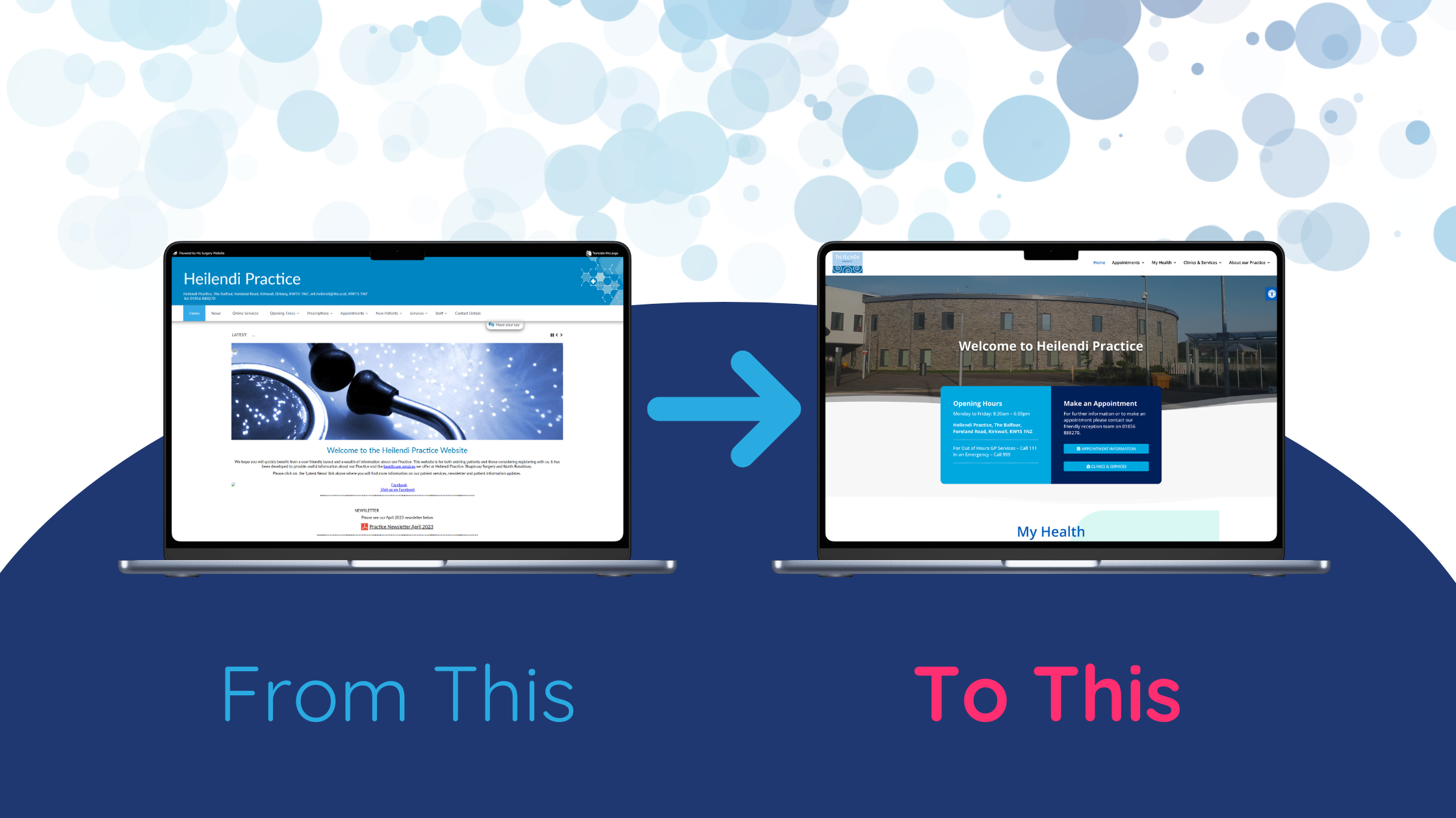
Heilendi Practice, an island community practice in Orkney, worked with Practest to improve its website, patient information and online request pathways.
The changes were introduced in phases rather than through a disruptive system overhaul.
Following the launch:
- More than a third of new patient registrations were being completed online
- Fit note requests were beginning to move to online forms
- Patients had clearer access to local services and self-referral information
- The practice reported reduced administrative pressure and more streamlined clinical duties
The results did not come from adding more technology for its own sake. They came from identifying repetitive patient journeys and making those journeys easier to complete.
You can view the Heilendi Practice website or read the full Heilendi Practice case study.
A platform change can be an opportunity
Sometimes a practice reviews its website because the design looks dated. In other cases, the decision is brought forward by a supplier change, a platform retirement or a system that is becoming increasingly difficult to maintain.
Whatever the trigger, replacing the website like for like can preserve the same underlying problems.
Before choosing a new design or supplier, consider:
- Which questions generate the most telephone calls
- Which processes create repetitive administrative work
- Which pages patients struggle to find
- Which forms create incomplete or unsuitable requests
- Which local services should be signposted more clearly
- How information will be reviewed and kept current
The design matters, but the patient journeys matter more.
Frequently asked questions
What information should a GP practice website include?
A GP practice website should clearly explain how to request help, access prescriptions, register, view available services, use self-referral pathways and contact the practice. It should also include opening hours, urgent-care information, accessibility information, privacy notices and realistic response expectations.
Can a better website reduce calls to reception?
It can reduce calls caused by missing information, confusing navigation and unclear processes. Patients must still be able to contact the practice by telephone or in person, but a clearer website gives people who can use digital services the option to complete routine tasks independently.
Does a GP practice website need to meet WCAG 2.2 AA?
NHS digital service guidance uses WCAG 2.2 AA as the minimum accessibility standard for patient-facing services. Meeting the standard requires accessible content, design, development and testing. An accessibility widget alone does not make a website compliant.
Your website should carry its share of the workload
A GP practice website is not a decorative extra or an online noticeboard. It influences how patients understand the service, where their requests are directed and how much avoidable contact reaches the practice team.
Done well, it can reduce confusion, improve access and remove repetitive work. Done poorly, it quietly adds to the pressure staff are already managing.
Practest helps GP practices review their websites, forms, patient journeys and communications so that digital access works more effectively for both patients and staff.
Contact Practest to discuss how your current practice website could work harder.
Further guidance: NHS England guidance on usable and accessible GP websites; NHS digital service accessibility guidance; and GOV.UK accessibility requirements.